Automated Image Resizing for Ecommerce
Author name: Mark James
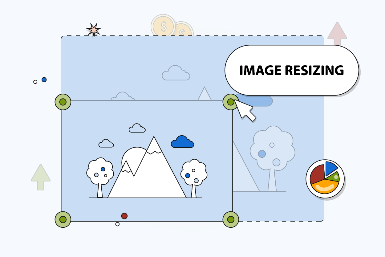
Why Automated Image Resizing Matters for Ecommerce
Responsive image delivery replaces a one-size-fits-all approach with different image sizes for different devices, so the browser can choose an appropriate size and save data on smaller screens. According to web.dev guidance on responsive images, serving a desktop-sized image to a mobile device can use two to four times more data than needed.
Manual image preparation scales poorly. Downloading a master file, cropping it in desktop software, saving five different versions, and uploading each one separately creates version control problems. Filenames become inconsistent, and high-resolution originals often get overwritten by compressed thumbnails, causing color and material variants to lose their connection to the correct SKU.
The most reliable workflow establishes a clear hierarchy: one approved master image produces multiple validated derivatives for channel-specific distribution. PIMinto operates as a central product information management and digital asset management (PIM/DAM) control layer to support this structure. You associate approved assets with products and variants inside the platform, which then organizes your channel outputs and prevents manual upload errors.

What Ecommerce Image Automation Includes
Resize, Crop, Compress, and Convert Solve Different Problems
While automated image resizing for ecommerce often serves as a blanket term, it covers several distinct operations. Changing pixel dimensions while preserving the original composition and aspect ratio is true resizing. Cropping removes part of the image to fit a different aspect ratio or focus on a specific detail. Meanwhile, compression reduces the encoded file size to improve load times, and format conversion changes the delivery format from a working file like a TIFF or PNG to a web-optimized JPEG or WebP. Conversely, upscaling enlarges a source that lacks sufficient detail, which frequently produces blurry results.
Responsive Delivery and Art Direction
Responsive delivery gives the browser multiple image candidates, allowing it to choose the most appropriate resolution based on the device width and pixel density while keeping the composition identical.
Art direction solves a different problem. When a layout changes, such as moving from a wide desktop hero banner to a vertical mobile screen, the image requires a different crop or focal point. A rendition is a controlled derivative built for these specific contexts, carrying a defined size, crop, format, and quality setting.
Metadata and Variant Context Matter
Image pixels alone cannot guarantee catalog accuracy. Product IDs, SKUs, variant IDs, asset roles, alt text, focal points, and approval statuses must remain governed separately from the visual file because a lifestyle photo requires different handling than a technical diagram. Color-specific product images must map exactly to their corresponding variant records. Since resizing an image does not automatically generate useful alt text or prove that the asset belongs to the correct catalog entry, you need separate controls for this metadata.
Create Channel-Specific Image Profiles
Storefront and Marketplace Requirements
Different platforms enforce different upload limits, display recommendations, and API constraints, so check channel documentation frequently as these specifications evolve.
| Channel | Documented Constraints & Guidance | Implication for Automation |
|---|---|---|
| Google Merchant Center | Minimum 500 × 500 pixels for all products starting Jan 31, 2027. Maximum 64 megapixels and 16 MB. | Treat 500 × 500 as the forward-compatible floor. Retain larger approved masters. |
| Shopify | Upload limits of 5000 × 5000 pixels (or 25 megapixels) and under 20 MB. | Store high-resolution masters within limits; let the storefront generate responsive sizes. |
| BigCommerce | Maximum 8 MB per image file or URL. | Maintain file-size profiles and utilize CDN transformations for responsive templates. |
| WooCommerce | Classic defaults include 300px thumbnails and 600px single-product images. | Active themes override defaults. Generate outputs that match the actual installed layout. |
Google Merchant Center: Build for the 2027 Threshold
Google Merchant Center's image link documentation sets a minimum image size of 500 × 500 pixels for all products beginning January 31, 2027.
Google recommends providing images around 1500 × 1500 pixels or larger for best performance across listing formats, alongside valid, crawlable URLs, matching file extensions, and correct MIME types. Because the product should generally occupy 75% to 90% of the image frame, automated cropping becomes a sensitive operation.
Storefront Profiles for Shopify, BigCommerce, and WooCommerce
Your own storefront offers more flexibility but still imposes hard limits. For instance, Shopify accepts product media up to 5000 × 5000 pixels or 25 megapixels, with a 20 MB ceiling. While their documentation suggests square images around 2048 × 2048 pixels display well, this functions as general upload advice rather than a universal rendering rule.
BigCommerce enforces an 8 MB limit per image file or URL, relying heavily on CDN delivery and responsive URL approaches. WooCommerce ships with classic default dimensions, such as 300-pixel product thumbnails and 600-pixel single-product images, but custom themes routinely override these settings.
Name Profiles by Use Case, Not Generic Size
Vague labels like "small" or "large" create confusion, so define profiles by their exact use case. Examples include master-original, pdp-main, pdp-zoom, listing-card, mobile-art-directed, google-feed-main, and partner-download. Every profile should document the target dimensions, aspect ratio, crop behavior, format, compression level, background requirements, naming conventions, and an explicit prohibition on upscaling.
Run a Governed Master-to-Derivative Workflow

Preserve and Link the Approved Master
The strongest product asset workflows start with pristine sources. After ingesting the highest-quality approved image available, retain its original filename, dimensions, format, color profile, and background type. You should avoid replacing the master asset with a thumbnail or repeatedly re-encoding a compressed derivative to create new sizes.
Once stored, connect the asset directly to the correct parent product, variant, bundle, or technical document. Color, size, material, and customized configuration imagery frequently becomes separated from catalog data in shared drives. When you manage product images and videos centrally, variant-level routing ensures the correct visual accompanies the right SKU during export.
Generate Derivatives With Focal-Point Rules
After defining channel profiles, you can generate derivatives using pre-generated files, on-demand CDN transformations, or a hybrid approach where common sizes render ahead of time and edge cases render on request.
Automated cropping poses a high risk for product catalogs, so apply focal-point and protected-area metadata to irregular products, machinery, furniture, apparel on models, bundles, and images containing text. If a product cannot be centered, the crop rule needs to know where the important features reside. In these cases, route complex exceptions to human review instead of trusting an algorithm to crop a technical label.
Validate, Publish, and Test
Generate files, then validate them against channel requirements before syndication. Automated checks can verify dimensions, megapixels, file size, format, MIME type, aspect ratio, variant association, and source resolution, preventing a low-resolution thumbnail from being upscaled. You will also need to confirm that the URL returns successfully, remains crawlable, and includes appropriate alt text.
Approved outputs then travel through feeds, scheduled tasks, or API connectors to the storefront. Testing completes the cycle when you review live product grids, product-detail pages, mobile views, variant switches, partner portal downloads, and Merchant Center diagnostic reports. PIMinto provides the governed product-data layer for these operations, replacing scattered spreadsheets with linked asset records and connected commerce platforms.
Deliver Responsive Images Without Layout Shifts
Use srcset and sizes for the Same Composition
Storefront performance relies on how images load in the browser. When the image composition remains exactly the same across devices, use the srcset and sizes HTML attributes to provide multiple resolution candidates, which allows the browser to download the most efficient file.
<imgsrc="/images/bottle-800.jpg"
srcset="
/images/bottle-400.jpg 400w,
/images/bottle-800.jpg 800w,
/images/bottle-1200.jpg 1200w
"
sizes="(min-width: 900px) 33vw, 50vw"
width="1200"
height="1200"
alt="Black stainless steel insulated water bottle"
>
The srcset attribute lists the available candidates and their true pixel widths. The sizes attribute tells the browser how wide the image will render on screen before the CSS fully loads.
Use <picture> When the Crop Changes
For responsive images, srcset lets an <img> element specify different versions of the same image for different screen sizes, while <picture> groups different <source> versions and lets the browser choose based on device capabilities such as screen size. Because standard HTML image elements help crawlers find and process images, Google Search Central documentation recommends them for discoverability and states that Google doesn't index CSS images.
Reserve Space With Accurate Dimensions
CSS-only resizing changes presentation, but it does not prevent layout shifts if the browser lacks dimension data. The web.dev Cumulative Layout Shift documentation identifies these dimension-less images as a primary cause of page jumping.
Store each rendition's intrinsic width and height metadata during generation so you can output the corresponding width and height attributes in the HTML. You can then reserve the necessary space in the layout using the aspect-ratio CSS property or an equivalent container technique. For this same-composition approach, candidates inside a srcset need an identical aspect ratio.
Avoid the Failure Modes That Break Catalogs
Quality and Crop Mistakes
Uploading one oversized file and forcing the browser to resize it wastes bandwidth and frustrates mobile users. Conversely, upscaling a tiny supplier thumbnail to meet a 500-pixel marketplace minimum produces visibly soft, unprofessional images because a nominal dimension increase never restores missing detail.
Forcing every catalog image into a strict square crop works for standard packaging, but it routinely ruins apparel, elongated hardware, and lifestyle photography. Aggressive compression policies create similar damage, particularly when applied to technical specifications or textured fabrics where clarity drives the purchase.
Variant, URL, and Cache Mistakes
Operational failures damage catalogs as quickly as poor image quality does. Sending a red product image to a blue SKU variant causes immediate customer confusion and returns, while publishing mismatched file extensions and MIME types, such as renaming a WebP file to end in .jpg, triggers marketplace feed rejections.
Overwriting existing image URLs without updating the cache versioning leads to storefronts serving stale assets long after the product packaging has changed. Assuming a WooCommerce default thumbnail size will permanently fit a heavily customized theme often results in blurred grid layouts.
Pre-Syndication Quality Checklist
Catching errors before they reach the storefront requires a systematic approach. Review this checklist before syndicating new batches:
- Source Quality: Are masters high-resolution and free of visible compression artifacts?
- Catalog Relationship: Do color and material images map strictly to their respective variant IDs?
- Rendition Specifications: Do dimensions, aspect ratios, and file sizes match the target channel profile?
- Delivery and Crawlability: Are URLs accessible, properly versioned, and free of mismatched file extensions?
- Accessibility: Does the feed or storefront output include descriptive alt text?
- Live-Channel Testing: Have you verified the cache behavior and layout stability on the live site?
Flag low-resolution originals and ambiguous automated crops for review, because silently generating questionable outputs always costs more to fix post-launch.

Operationalize the Workflow With a PIM/DAM
What a PIM/DAM Should Govern
Moving image preparation out of shared folders requires a system designed for catalog complexity. A capable PIM/DAM governs product and variant relationships by assigning specific asset roles like "main view" or "swatch." It manages approval workflows, usage rights, focal-point coordinates, and localized alt text. Through channel eligibility rules, it dictates which marketplaces receive which images, while version history protects against accidental deletions. By establishing these controls, your team can automate formatting requirements using PIM software for B2B ecommerce or retail environments without breaking data integrity.
How PIMinto Fits the Workflow
PIMinto provides the central product-data and digital asset foundation necessary for this workflow by storing digital assets directly alongside your product data, ensuring variant images never lose their SKU associations.
With native API connectors, PIMinto pushes updated listings to major sales channels. A direct Shopify PIM integration eliminates manual media uploads, while connections for WooCommerce, Magento, BigCommerce, Wix, and Google Merchant Center handle multichannel distribution.
As of September 6, 2026, PIMinto's transparent pricing scales with growing operations. The Starter tier begins at $0 per month, Essentials at $300, Premium at $600, and Super at $950, with custom pricing available for Extreme tiers. Because every paid subscription includes unlimited users, data outputs, onboarding, training, and data migration, scaling remains predictable. Verify current capabilities and pricing directly, and consult the PIMinto team to confirm specific native image-transformation rules before building your channel profiles.
Quick Answers and Next Actions
Is there a universal best size for ecommerce images?
The correct size depends on channel requirements, display context, and device resolution. Base your profiles on actual rendered layouts and marketplace minimums.
Should all product images be cropped into squares?
Square crops simplify grid layouts but often cut off critical details on irregular items. Use square profiles where appropriate, but retain original aspect ratios for technical and lifestyle images.
Does resizing solve the same problem as compression?
Resizing changes the physical dimensions of the image on the screen, whereas compression reduces the file size by changing how the data is encoded. Both are necessary for an optimized catalog.
PIMinto replaces spreadsheet chaos with a single source of truth for your product data and digital assets. See how our platform centralizes your images, enriches your catalog, and automates multichannel syndication without artificial paywalls.
Visit PIMinto to request a free migration or catalog workflow assessment today.
Modified on: 2026-09-06
Blogs you might like
-

Best PIM Software for Shopify in 2026
Shopify handles products well until the catalog outgrows it. Variants pile up, supplier files arrive in different formats, a second store needs the same products with different content, and spreadsheets become the real system of record. That is the p...
-

Jewelry Product Catalog Software: Managing Product Data, Line Sheets and B2B Catalogs
One engagement ring design can come in three metals, four center-stone weights and twelve ring sizes. Add natural and lab-grown versions, a wholesale price for boutiques and a separate price list for Europe, and a single design turns into hundreds of...
-
Beauty and Cosmetics Product Data Management: A PIM Guide for Brands
A lipstick launches in 20 shades. Each shade has its own barcode, swatch, product photo, shade description and stock status, and every retailer wants that information in a different spreadsheet. Six months later the brand adds a matte version and a m...
-

Food and Beverage Product Data Management: A Practical Guide for Brands and Distributors
A granola bar recipe changes: almonds replace cashews. The new label goes to print, but the allergen statement on your website, the spec sheet your distributor uses and the listing on an online grocery site still say "contains cashews." Nobody made a...